
Don’t give your website visitors the creeps (well, unless you’re selling props for horror movies or promoting a haunted house tour). Give them the experience they deserve! In this Halloween blog special, we’ll give you three design elements that you should avoid having on your website, because they’re terrifyingly outdated, deadly boring, or just… bloody awful. So what are these website ghosts?
- Company videos with haircuts from the 80s that remind you of psycho killers
Ghost’s power: To portray your company in a ridiculing way, so that your visitors burst into laughter and consider you a technological laggard that is not to be taken seriously.
 Videos are cool! They are easy to digest (we recommend served with a side of rat tails), they are demonstrative (especially useful when you need to visually demonstrate the right technique for flying on your broomstick) and they can be fun, increasing your vampire clientele's interest in your offer conveniently packed blood bags. But having any video on your website is not a guarantee of success! There are some pretty awkward company videos, and it doesn’t really matter if they were shot in the 80s, 90s or 2015. But then, if they WERE shot in the 80s or 90s, they are practically walking dead!
Even if your vampire hunting kit still looks and works the same way and you don’t see an urgent need to shoot a new promotional video, be aware that showcasing older videos that are apparently outdated can send your potential customers a bad message about your approach towards technology and innovation. And you don't want them to see you as a sad, dried up mummy. Examples of outdated features include old-style video intros (animated letters flying around the screen to eventually form a strap line when a Rocky-style music is played), hairstyles from the 80s (sexy mullets & perms), clothing and office/plant/haunted castle furnishings. Videos are often the first point of interaction, so represent your brand!
Now it’s time to watch some funny infomercials in this 10 minute long video on YouTube!
- Bad flash animation and automatically playing music that cannot be turned off and makes you jump out of your skin
Ghost’s power: To make your website slow to load, invisible to search engines, old-fashioned to look at, annoying to interact with and easy to abandon.
Do you know the feeling when you open a new site, music starts playing out loud, so that your heart jumps out of your throat and no matter how hard you try, it cannot be switched off? Especially handy in a room-full of sleeping hounds that you don't want to wake up, right?
Most of you will recognize flash animation in form of a slow-loading animated intro that appears on a homepage and prevents you from placing a new coffin order. According to the User Experience expert Jakob Nielsen, the presence of flash on a website is a reliable recipe for a usability disaster. “It makes bad design more likely, it breaks with the Web's fundamental interaction style, and it distracts attention from the site's core value.” Read Nielsen’s article "Flash: 99% bad" here. The article might be freakily old, but still relevant.
And there are additional issues that are of a crucial importance today: If your website is entirely flash-based, it might not work on all mobile devices, it might load as slowly as a zombie walking down the street, and can’t be read and therefore crawled by search engine robots, spiders and other creatures. Here’s what Google has to say about flash: “We're continually working to improve our indexing of Flash files, but there are some limitations. “...”We recommend that you use rich-media technologies like Flash primarily for decorative purposes, and instead use HTML for content and navigation.“ Moreover, many people block flash in their browsers, so they wouldn’t even see the beautiful blood splatter flash you designed for them. While there are examples of modern flash animation that are jaw-dropping in a positive way, it is the outdated retro flash that persists on a number of company websites that gives your visitors the creeps.
- Text and images on mobile devices sliced up and scattered around like in a scene from The Texas Chainsaw Massacre
Ghost’s power: To make your content difficult to access and read, so that your visitors scream in frustration and never return to your website again.
Mobile is not a trend, it is a reality and whether you're selling spare blades to Edwards and Wolverines, or providing dead bride resuscitation services, your website needs to address that. If your website is not mobile friendly, you provide a frustrating experience to your visitors, encouraging murderous intentions against you. Whether you decide to design a mobile friendly version (the best solution for user interaction) or build your website in a responsive design (a more economical solution when you're saving up for a new crystal skull), you are on the right track. Websites that are not mobile friendly might result in: text being dismembered, images being chopped up, content not displaying in an easy to access manner. All making it difficult for your visitors to understand why your cure of werewolfism is more effective than any other spell or potion offered on the market .
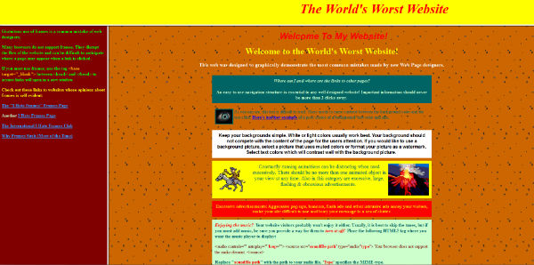
Feel free to torture yourself by looking at more design malpractices, visiting the self-proclaimed World’s Worst Website by Angelfire.
So if you’ve seen any of these ghosts around your website, call in the ghost busters and read more tips on creating user-friendly websites that won’t give your visitors the creeps in our ebook!
